In either a pie or bar chart, is there a way to show the top five categories of something after accounting for Workshop filters? For example, if each of a thousand sales people belongs to any one of a hundred teams, can I chart the sales totals of each of the top 5 teams after accounting for Workshop filters like region and years of experience?
Can you clarify which objects we’re dealing with? I assume it looks like the following: salespeson, team, deal. And your app filters an object set of salesperson and then computes the sum of deal.value over team.team_id – or something like that?
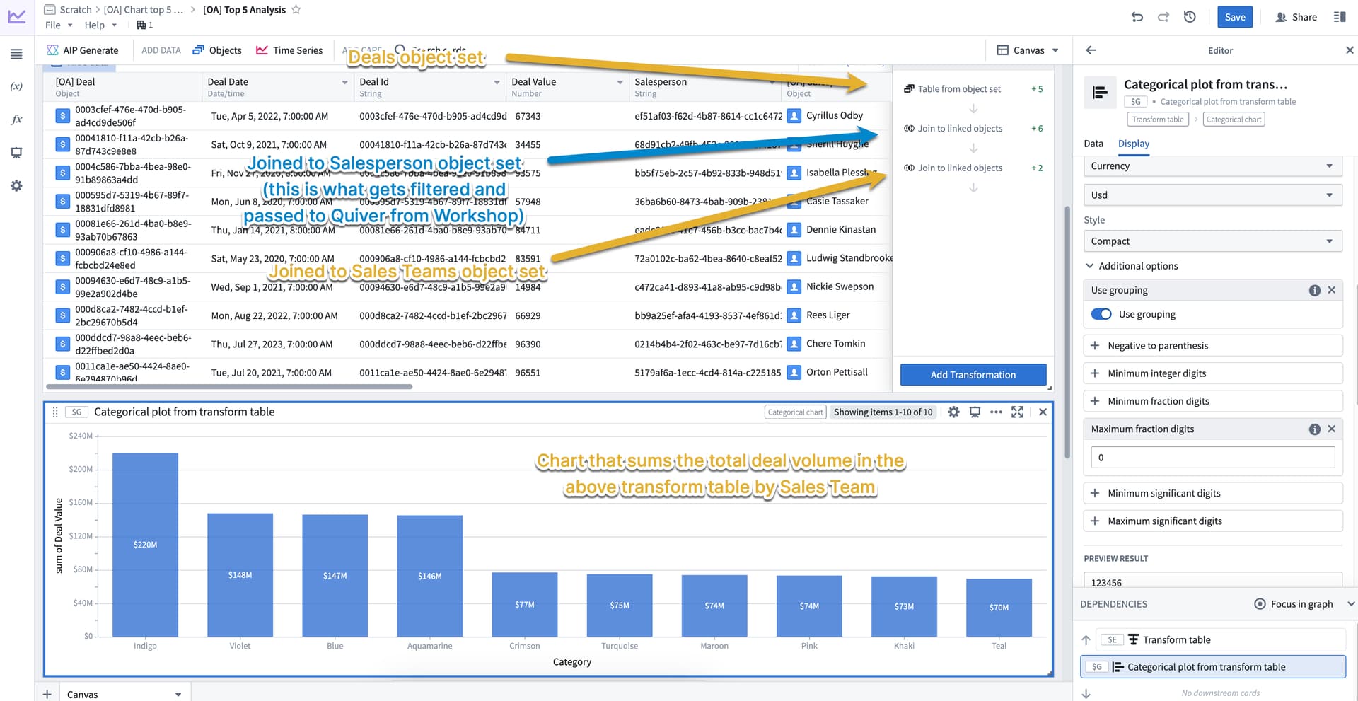
Hi Joel, I can’t figure out how to do this with Workshop’s built-in widgets. But I can do it with a Quiver chart, which can be embedded into Workshop pretty easily.
I’m attaching a screenshot of what the Quiver part looks like. There are a few key elements here, but keep in mind that you can probably do the join in a different order depending on the specifics of your situation.
- In Quiver, I’m using a Transform table to let me join the object sets. This gives me a denormalized table that I can use as input into a chart
- Note that one of the object sets presumes it has been filtered in Workshop and passed into Quiver as an input
- The chart is a simple aggregation (sum) over the deal value property and grouped by sales team
1 Like