I would like to get some feedbacks about best practice related to Charts display that contain long descriptions…
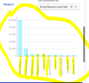
See screenshot, the name is not fully displayed on the Axis.
Additional question, what are the impacts of this “Long text” option within Ontology Manager?
From my vantage point, choosing the Long text interaction mode tells Foundry more about what not to do with that property than what to do with it (specifically, don’t let users sort by long text properties and don’t display them as selectable options in drop-downs or filters). Today, the only effect that Long text has – that I’m aware of – is causing text to be displayed either as a single line or multiple lines and variations on that distinction. See the video below for an example of what I mean.
First question: If you want to deviate from the automatic display behavior for the Workshop chart widget you’ll need to try a Quiver dashboard with a Vega Plot chart. If you want even more customizability you could try iframing in a Slate app that uses whatever custom javascript you want to display the chart…but I would advise against that because it would be a lot of work for minimal gain.
Here’s a video that answers your question in more detail: